[ 01 ]
Spin
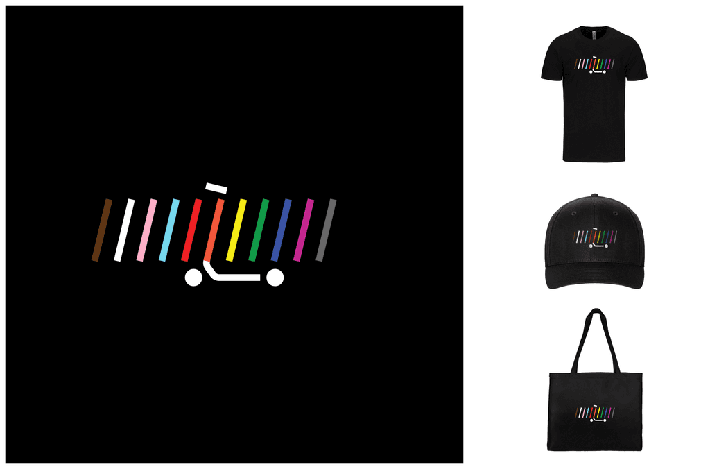
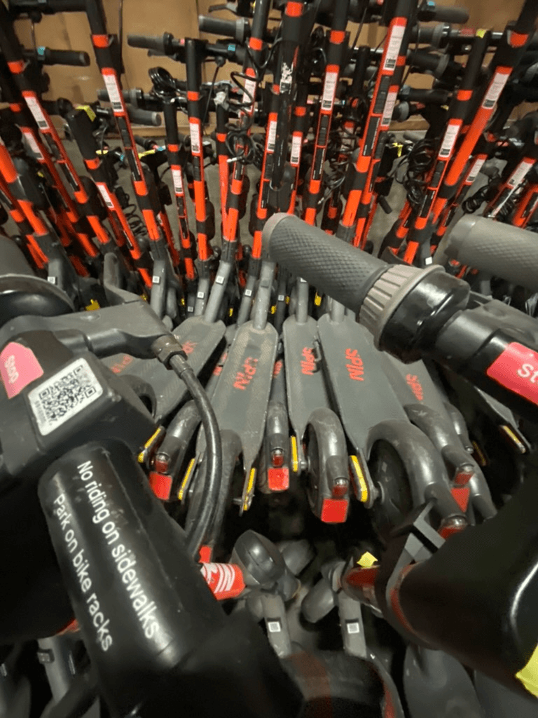
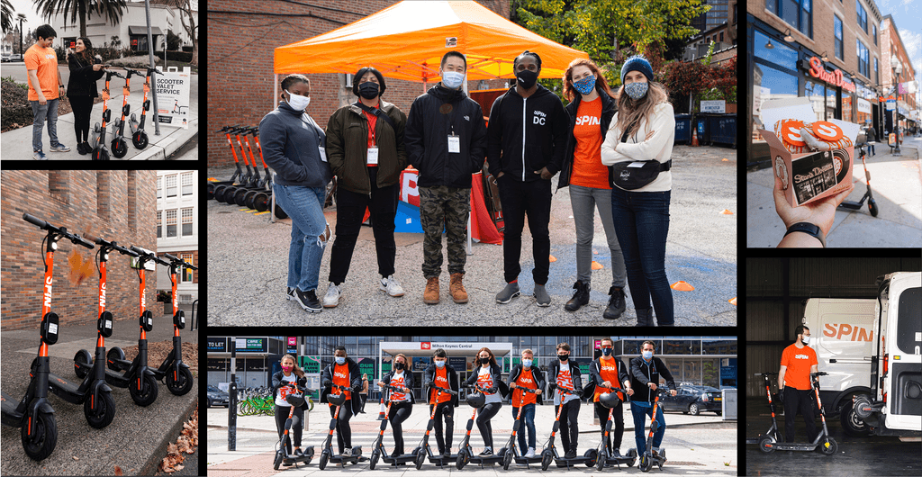
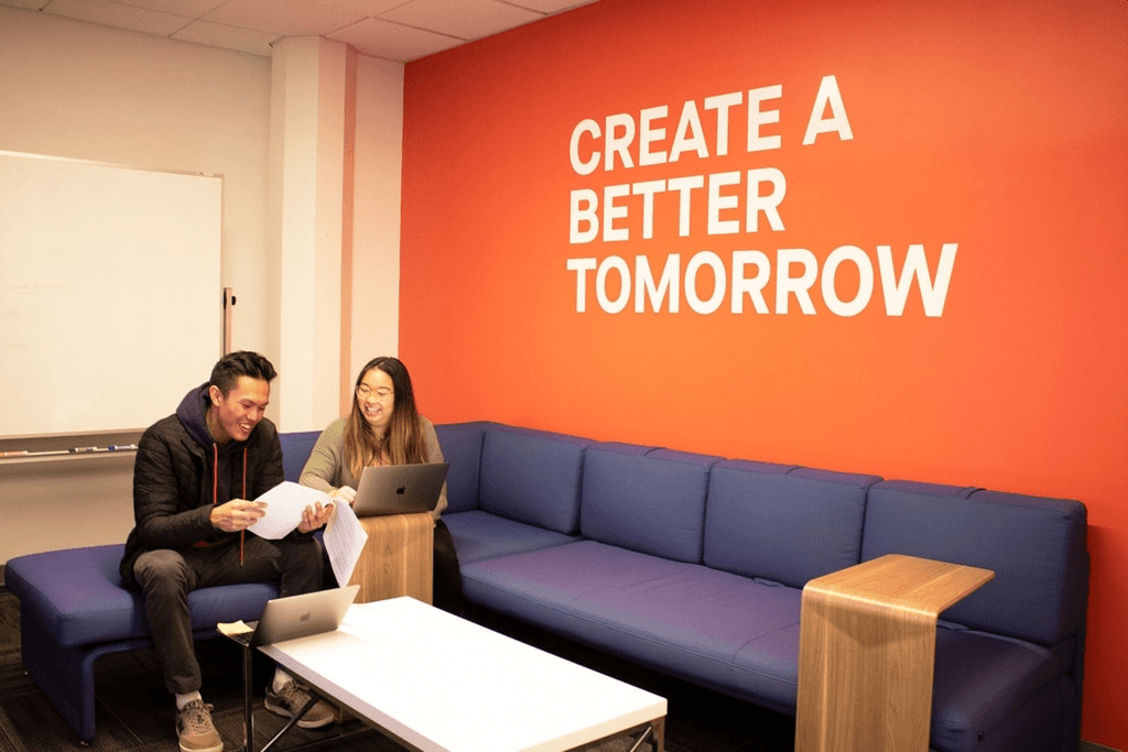
As Head of Design at Spin, I led 10 creatives and coordinated with various external agencies. My role involved directing our creative vision and ensuring consistency across all design aspects, from app interfaces and marketing to vehicle design and special projects like iRacing skins. This leadership ensured innovation and brand alignment in every design facet.
ROLE
Head of Design | Senior Product Designer
Responsibilites
UI/UX, Product, Visual Design, Creative Direction
TOOLS
Figma, Sketch, Lottie
CREDITS
Justin Kohout (illustration), Jeffrey Kordova (Animation)
{2}
Color pallete
{2}
Color pallete


{3}
Ride Smart Challenge
Master scooter safety with our interactive ‘Ride Smart Challenge’! Pass this fun quiz to understand local laws and proper riding etiquette, ensuring you ride responsibly. Fail, and you’ll need to retake the quiz before you can rent. This engaging educational tool has successfully reduced traffic incidents by 80%, making our streets safer for everyone.


{2}
Color pallete
{2}
Color pallete


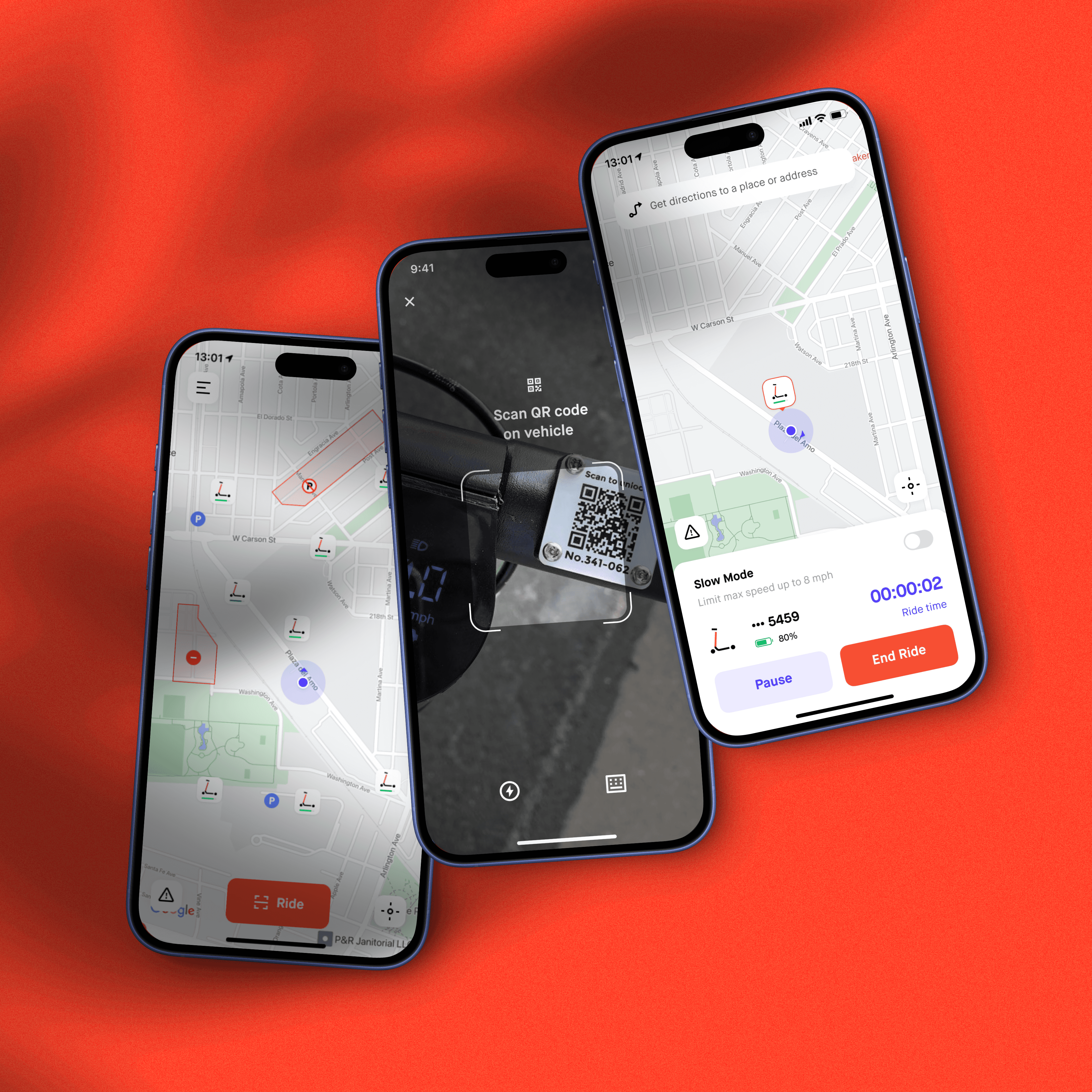
For months, I collaborated intensively with Apple in preparation for their WWDC 2020 showcase, focusing on the integration and launch of their innovative App Clips feature. This partnership involved designing and refining user experiences that highlight the seamless functionality and immediate utility of App Clips, ensuring a standout presentation at the event.




{4}
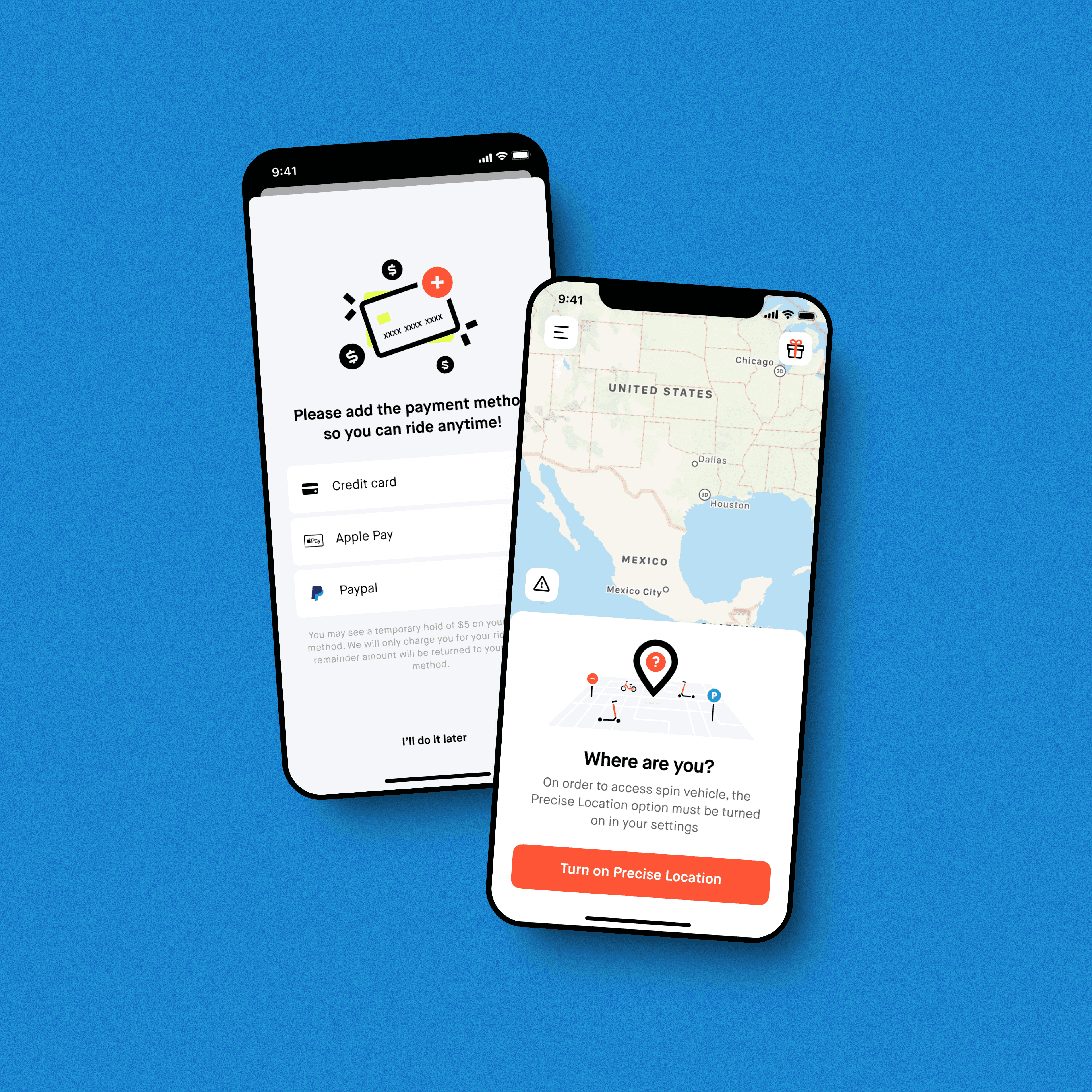
Spin’s App Redesign
I significantly improved the onboarding conversion for Spin by 1.5x. My redesign of the app not only streamlined user conversion rates and activation times but also helped enhance the revenue from engagement campaigns.
{4}
Spin’s App Redesign
I significantly improved the onboarding conversion for Spin by 1.5x. My redesign of the app not only streamlined user conversion rates and activation times but also helped enhance the revenue from engagement campaigns.
{4}
Spin’s App Redesign
I significantly improved the onboarding conversion for Spin by 1.5x. My redesign of the app not only streamlined user conversion rates and activation times but also helped enhance the revenue from engagement campaigns.
3.0B
2.5B
2.0B
1.5B
1.0B
0.0B
Chart types
3.0B
2.5B
2.0B
1.5B
1.0B
0.0B
Chart types
{5}
Where Creativity Meets the Road
I led at Spin, encompassing multiple facets of the brand’s identity. This includes detailed app interfaces aimed at enhancing user experience, dynamic marketing materials, and custom vehicle designs. Each element reflects the comprehensive oversight I provided, ensuring brand consistency and innovation across digital, print, and physical product designs. This collection highlights my leadership in steering a cohesive and creative design strategy executed by a team of ten creatives and in collaboration with external agencies.


{6}
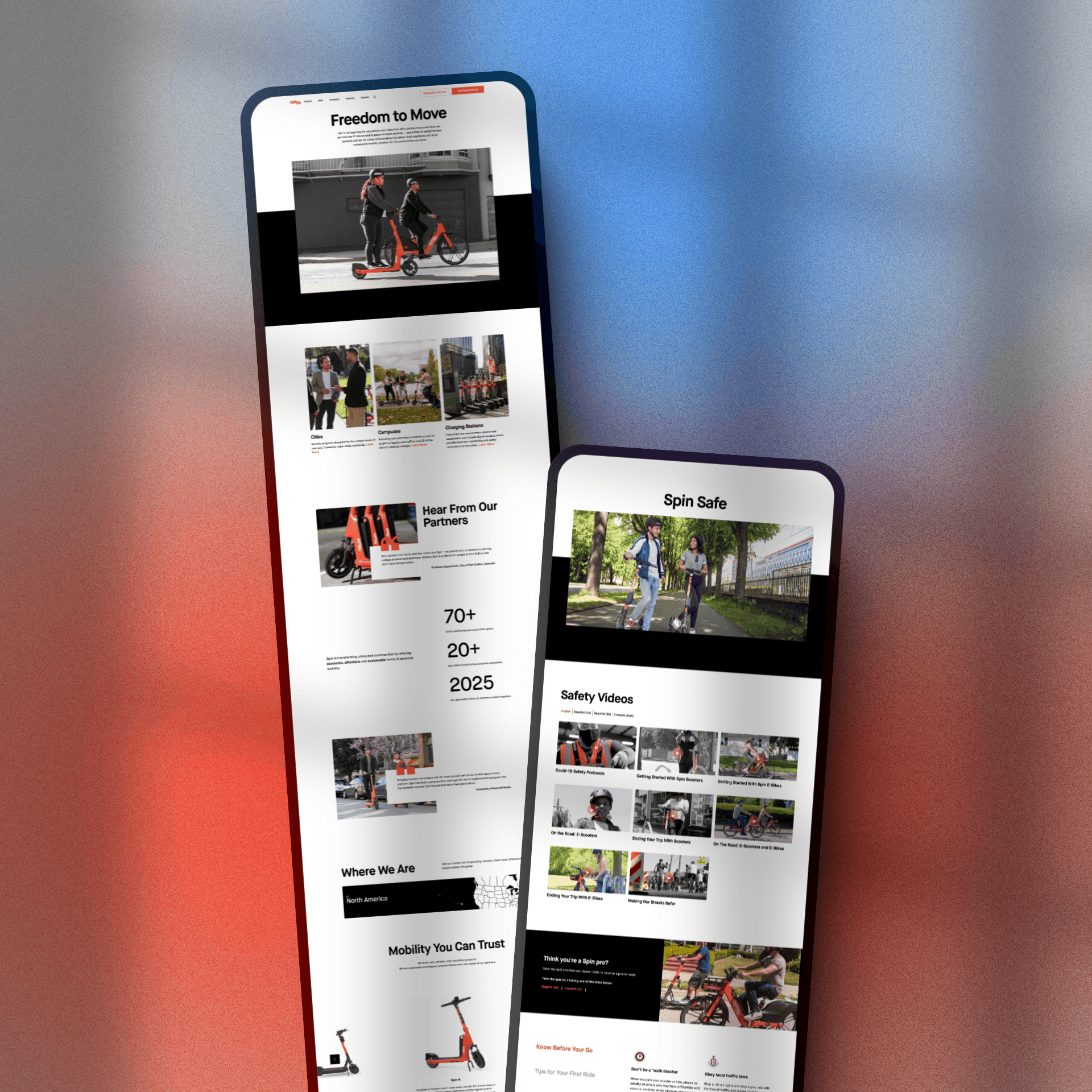
Spin’s Website Redesign
Our comprehensive redesign of Spin’s website aimed to enhance user engagement and streamline information access. The updated site features improved navigation and a user-friendly interface, showcasing our commitment to safety through easily accessible educational content, partner testimonials, and detailed service maps. This digital transformation not only enriches the user experience but also aligns with our mission to provide reliable and safe urban mobility solutions.


{7}
Streamlined Elegance
I realized the existing Spin website was too complex and obstructive for efficient user navigation. My focus was to simplify the information architecture to better serve our customers, partners, and municipal stakeholders. The redesign resulted in a more intuitive and user-friendly website, which significantly improved site traffic by 30% and increased user retention by 20%, demonstrating our commitment to accessible and efficient urban mobility solutions.
{8}
Get Close, Really Close
Want to see what’s behind our slick design? Dive into our Figma file and zoom in as close as you want—no one is looking! Discover our color choices, typography, and all the UI goodies that make our visuals pop
{8}
Get Close, Really Close
Want to see what’s behind our slick design? Dive into our Figma file and zoom in as close as you want—no one is looking! Discover our color choices, typography, and all the UI goodies that make our visuals pop
{8}
Get Close, Really Close
Want to see what’s behind our slick design? Dive into our Figma file and zoom in as close as you want—no one is looking! Discover our color choices, typography, and all the UI goodies that make our visuals pop
Weekly newsletter
Sunday service
Get the latest designer news, resources and more — delivered to your inbox every Sunday.

Maximus Decimus Meridius

Jean-Baptiste Emanuel Zorg

President Whitmore
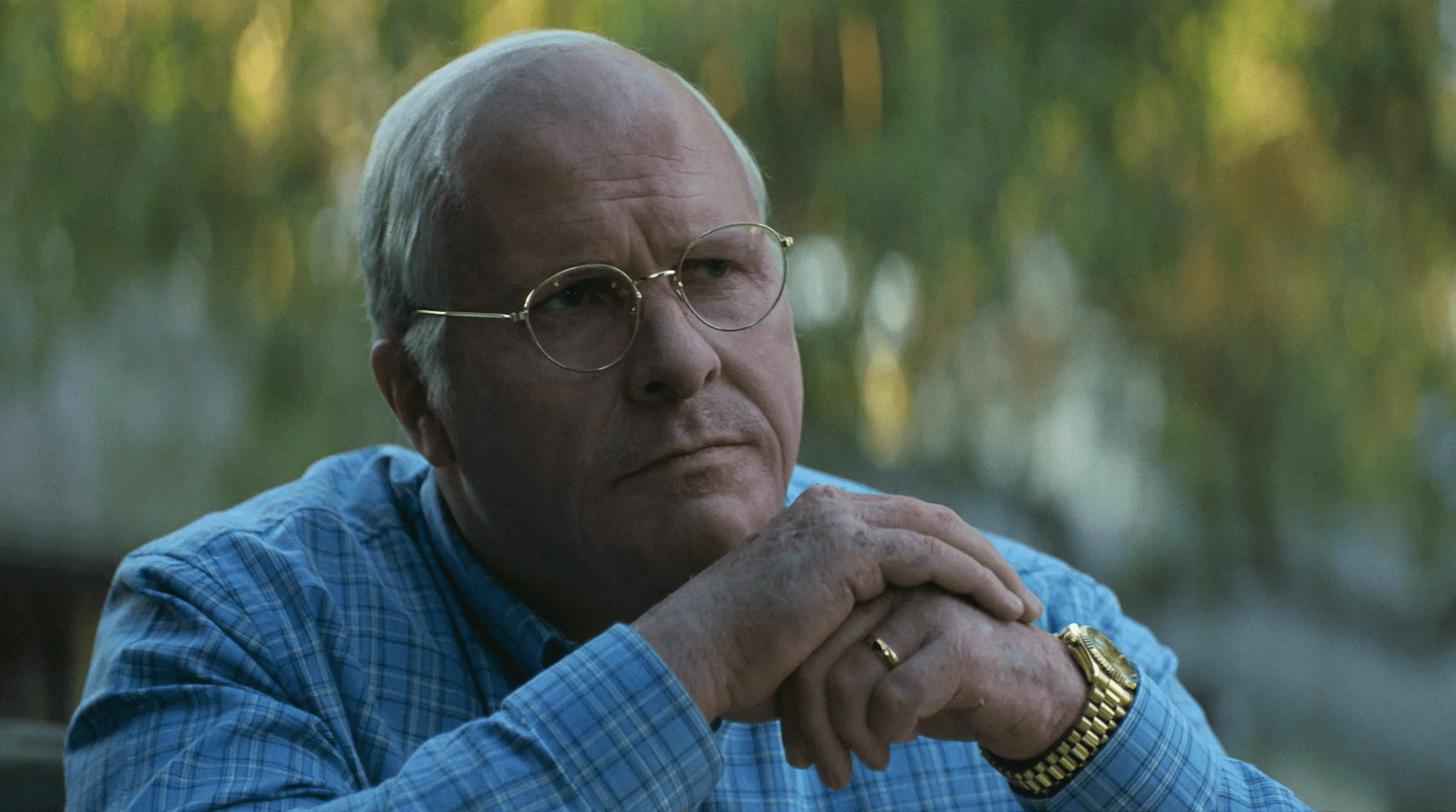
Dick Cheney
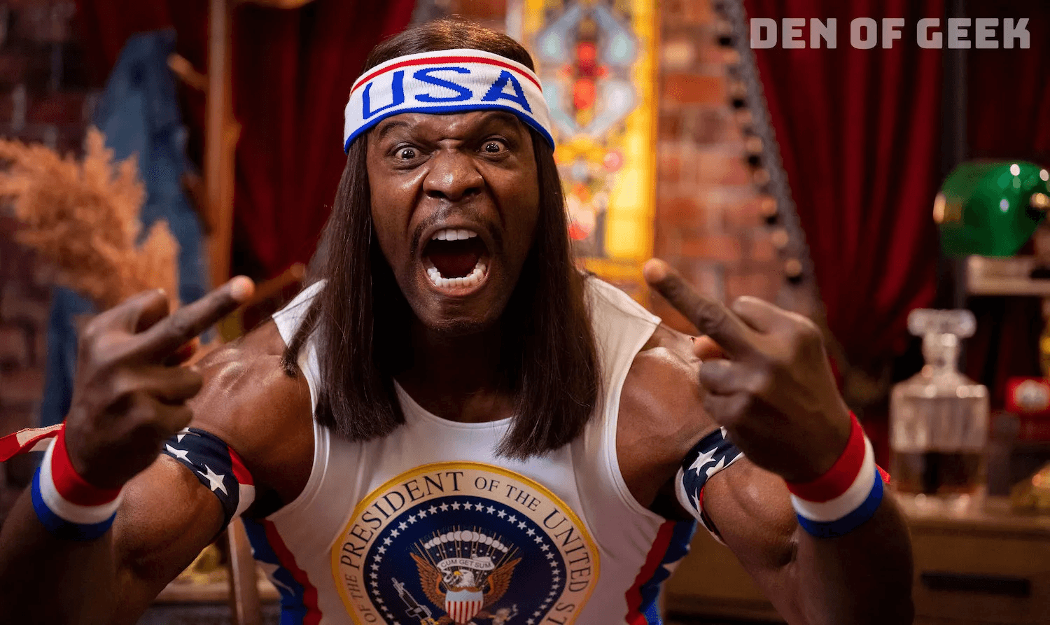
President Camacho
Loved by 1000+ world leaders
Thanks for stopping by.
Local weather:
Weekly newsletter
Sunday service
Get the latest designer news, resources and more — delivered to your inbox every Sunday.

Maximus Decimus Meridius

Jean-Baptiste Emanuel Zorg

President Whitmore

Dick Cheney

President Camacho
Loved by 1000+ world leaders
Thanks for stopping by.
Local weather:
Weekly newsletter
Sunday service
Get the latest designer news, resources and more — delivered to your inbox every Sunday.

Maximus Decimus Meridius

Jean-Baptiste Emanuel Zorg

President Whitmore

Dick Cheney

President Camacho
Loved by 1000+ world leaders
Thanks for stopping by.
Local weather:


Did my site
Impress you
hit different
or were you
not impressed
Sus Skill issue
What do you think?
Did my site
Impress you
hit different
or were you
not impressed
Sus Skill issue
What do you think?


